There is a small but irresistible corner of the internet currently obsessed with catastrophic design mistakes: signs where a single misplaced space turns “Kids Storage” into something wildly inappropriate, or logos whose poor kerning breaks brands in a single glance. The viral popularity of threads like Bored Panda’s feature on “design examples that show how important proper spacing really is” isn’t just entertaining—it’s deeply instructive. Those images prove a simple truth: refinement lives in the details, and a tiny misalignment can cheapen an entire space.
Your garage is no exception. Whether you’re planning a high‑end workshop, a climate‑controlled car gallery, or simply a serene, orderly extension of your home, the difference between “upgraded” and “effortlessly elevated” is often hidden in the same sort of micro‑decisions that make those botched layouts go viral. In an era where design mishaps trend by the hour, today is the right moment to ensure your next garage upgrade is the sort of space people share for the right reasons.
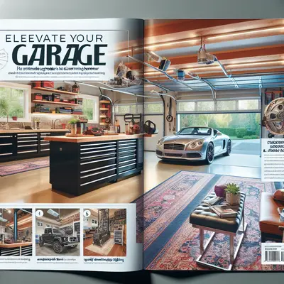
Below are five exclusive, detail‑driven insights that will help you transform a merely functional garage into a meticulously orchestrated environment—one that would never become a meme for the wrong spacing.
The Art of Negative Space: Planning the Garage Like a Luxury Boutique
The internet’s favorite design fails all share the same sin: nobody respected negative space. Words and elements are jammed together until they become unreadable—or accidentally obscene. Home garages often suffer the same fate. Tools, storage, vehicles, and hobbies are squeezed into every visible corner until the room feels tense and visually noisy.
Begin your upgrade by designing emptiness on purpose. Treat your garage the way a luxury boutique treats its floor plan: curated, not crammed. Establish clear circulation lanes—1,000–1,200 mm (roughly 3.5–4 ft) of unobstructed aisle between the car and any cabinetry or workbench. Reserve a visual “breathing zone” at eye level along at least one main wall where there are no hanging tools, no pegboards, no busy graphics—just continuity of color or refined materials. This deliberate absence of clutter instantly elevates the space. It tells the eye, “This was designed,” not “This happened.”
For multi‑bay garages, align major elements along clean visual axes: tool chests centered under wall cabinets, lighting fixtures aligned with the vehicle centerline, and floor tiles or epoxy color blocking that visually “frames” each car. These micro‑alignments cost nothing in functionality, but they deliver an aesthetic coherence that feels distinctly premium, the polar opposite of those chaotic, badly spaced signs trending online.
Precision Storage: From Visual Noise to Curated Display
Viral examples of bad kerning prove that most viewers can sense something is “off” even if they can’t articulate why. Garage storage has the same psychological effect: a pegboard full of mismatched hooks and crooked tools may be technically organized, but it broadcasts disorder.
Upgrade your storage with the mindset of a gallery curator rather than a stockroom manager. First, unify your hardware visually. Choose one finish—brushed stainless, matte black, or anodized aluminum—and commit. Matching handles, hooks, and brackets have a surprisingly powerful calming effect. Then, instead of scattering small storage solutions across multiple walls, consolidate: a single, well‑designed bank of tall cabinets with integrated drawers looks infinitely more refined than six different plastic towers from three different decades.
Inside the cabinets, precision inserts are your quiet luxury. Custom foam cutouts for your most‑used tools, velvet‑lined drawers for detailing products, or modular bins with clear, consistent labeling eliminate the “visual chatter” that makes many garages feel like warehouse clearance. The goal is not just to store, but to reveal: when you open a drawer, it should resemble a high‑end instrument case, not a junk drawer. The internet has made us acutely aware of poorly spaced letters; apply that same intolerance to haphazard organization.
Lighting as Architecture, Not Afterthought
Those viral design screenshots often look worst in bad lighting: shadows exaggerate misalignment, and cheap fixtures flatten everything into the same dull tone. A refined garage upgrade treats lighting as architectural, not incidental.
Begin with layers. Overhead, replace a single harsh fluorescent with a grid of low‑glare LED panels or linear fixtures, evenly spaced and aligned with the vehicle footprint. Aim for 70–100 lumens per square foot in work zones and slightly less in display or parking areas. Then introduce vertical lighting: wall washers or concealed LED strips tucked under upper cabinets. This eliminates the deep shadows that cheapen even the best cabinetry and makes the space feel deliberately sculpted.
For those who treat their vehicles as rolling artwork, consider accent lighting borrowed from galleries: narrow‑beam spots aimed at key design lines of the car, or floor‑integrated uplights that graze along wheels and side panels. Crucially, select a consistent color temperature (3000–4000K for warm sophistication; 4000–5000K for a crisp, workshop feel) and maintain it religiously. Mixing starkly different color temperatures is the lighting equivalent of bad word spacing: instantly noticeable, quietly irritating, and deeply unrefined.
Surfaces That Whisper Quality: Floors, Walls, and the Quiet Luxury of Tactility
If poorly spaced fonts can make a global brand look amateur, poorly chosen surfaces can drag your entire garage upgrade back into “utility room” territory. The most sophisticated garages share a common trait: every surface has been considered not only for durability, but for how it feels and sounds.
On the floor, step beyond basic gray paint. High‑build epoxy systems with metallic pigments, quartz aggregates, or subtle marbling create a gallery‑grade base that resists chemicals while visually anchoring the space. For an even more architectural approach, consider large‑format porcelain tiles designed for automotive load, laid with tight, consistent grout lines. The precise repetition of those lines will echo the kind of meticulous spacing missing in those viral design disasters.
Walls deserve equal attention. Instead of unfinished drywall or random patchwork shelving, opt for a layered approach: a robust slatwall or rail system concealed behind sleek panels, so you maintain flexibility without visual clutter. Add a tactile finish—fine‑textured paint, microcement, or even acoustically treated wall sections—to soften sound reflections. A refined garage should not clang; it should have a quiet, controlled acoustic profile. Even the sound of a ratchet or a trolley jack moving across the floor can feel premium when the surfaces are chosen with care.
Integrated Technology: Seamless, Not Shouted
Many of the world’s most shared design fails come from the same mistake: someone tried to add “more” without understanding how it fit into the whole. The result is jarring, unbalanced, and unintentionally comic. The same pitfall exists with garage tech upgrades. Smart openers, cameras, sensors, EV chargers, and audio systems can easily become a chaotic patchwork of blinking lights and tangled cables.
The refined approach is to treat technology like a built‑in, not a bolt‑on. When planning your upgrade, map a single, discreet conduit or cable route that anticipates future additions: from the main panel to the opener, to the EV charger location, to any workstation, to ceiling‑mounted access points or speakers. Conceal everything within walls, cabinetry, or surface‑mounted raceways that match your finishes. Label junction boxes and ports elegantly—small, engraved plates instead of adhesive stickers and masking tape.
Choose devices that visually align as well as functionally integrate: similar faceplate finishes for wall controls, slimline keypads rather than bulky remotes, and an opener motor with an enclosure color that harmonizes with your ceiling. Then, consolidate control. A single, well‑configured smart‑home app or wall‑mounted control tablet is infinitely more luxurious than six incompatible apps and a row of orphaned remotes. The goal is a space where the technology feels invisible until summoned, like good spacing in typography—present everywhere, yet never drawing attention to itself.
Conclusion
The sudden popularity of “bad spacing” and design‑fail compilations online is more than a passing amusement; it’s a cultural reminder that refinement is seldom about grand gestures. It’s about margins, alignments, breathing room—thousands of small decisions that collectively signal care, or carelessness.
A truly elevated garage upgrade embraces that lesson. It honors negative space, curates storage, sculpts light, refines surfaces, and hides complexity behind quiet, disciplined order. In a world where design mistakes can become memes overnight, your garage has the potential to be something very different: a private proof that when every detail is considered, the most utilitarian room in the house can also be its most sophisticated.
Key Takeaway
The most important thing to remember from this article is that this information can change how you think about Upgrades.